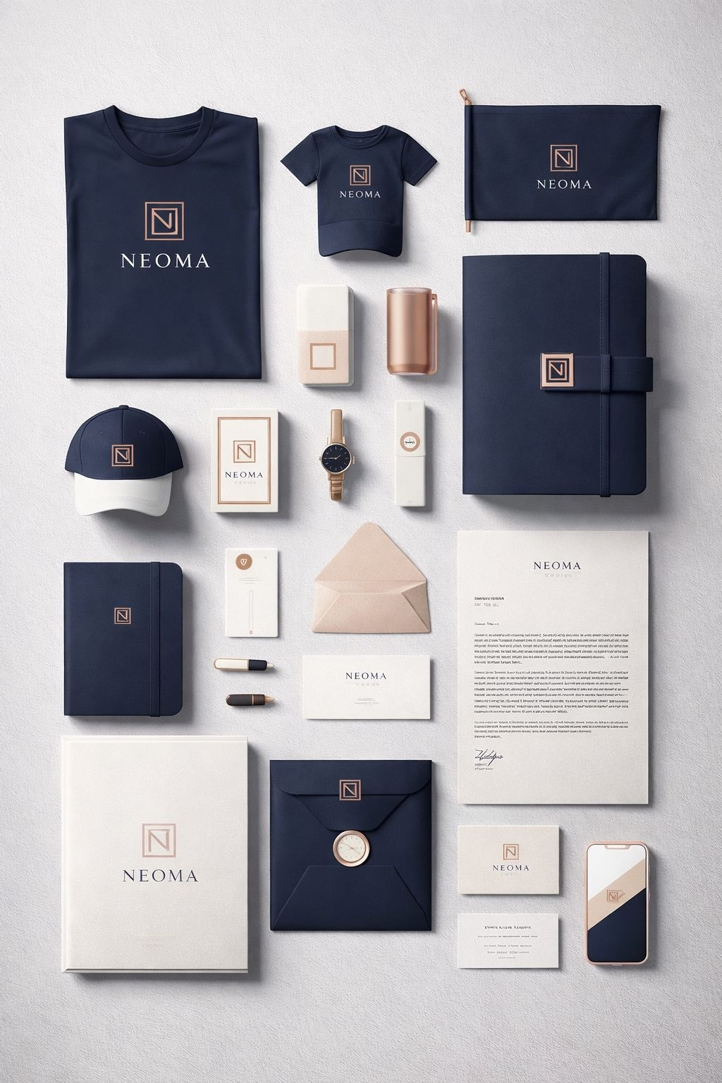
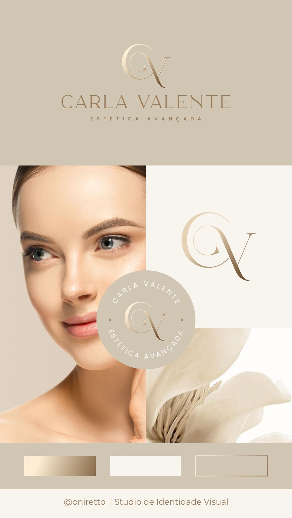
We have reached the final pieces of the puzzle for your new brand’s visual identity: your logo and your typography. These are the tangible assets that will live on your website, your social media, and your business cards.
Your logo is a visual representation of your unique brand and serves as a crucial element in your brand’s identity. While it is tempting to go for something incredibly detailed, a simple logo is often more memorable and versatile.
Avoid overly complicated designs that can be difficult to reproduce or lose impact when scaled down.
Focus on clean lines, clear fonts, and minimalistic elements that convey your brand’s essence.
Avoid trendy designs that may quickly become outdated and opt for a timeless and versatile logo that can evolve with your brand.
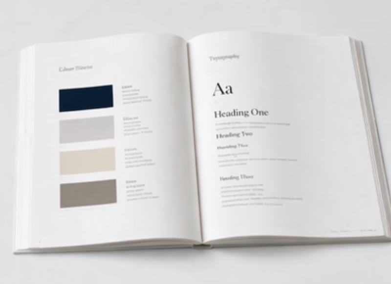
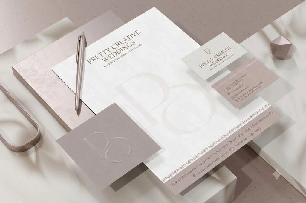
Equally important to your logo is your typography. Typography plays a crucial role in establishing the visual identity of a brand and should be consistent across all brand communications, including marketing materials, website, and social media.
When we select fonts for our clients, we make sure they do two things: reflect the brand’s personality and remain perfectly legible. For instance, if your brand is playful and youthful, you may opt for a fun and quirky font, whereas a luxury brand may require an elegant and sophisticated font. Furthermore, your chosen fonts should be easy to read, both in print and digital formats.
The golden rule of typography is that less is often more.
Avoid using too many fonts as it can create visual clutter and confusion.
Stick to a maximum of two or three fonts that complement each other and create a cohesive look.
A combination of a primary font for headings and a secondary font for body text can work well in most cases.
By keeping your logo simple and your typography clean and contrasting, you guarantee that your brand looks sharp, professional, and ready to take the digital world by storm.