One of the most exciting days for any new business owner is picking out their brand colours. It is a highly subjective and creative process, but it requires strategy. If you want your online presence to be professional and persuasive, you cannot just pick your favourite shade of blue and call it a day.
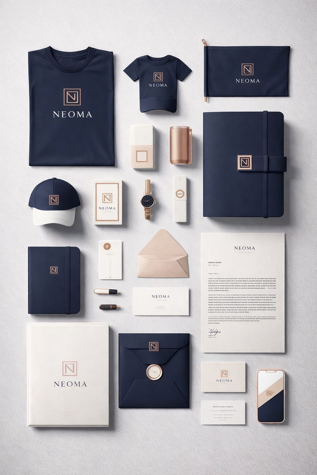
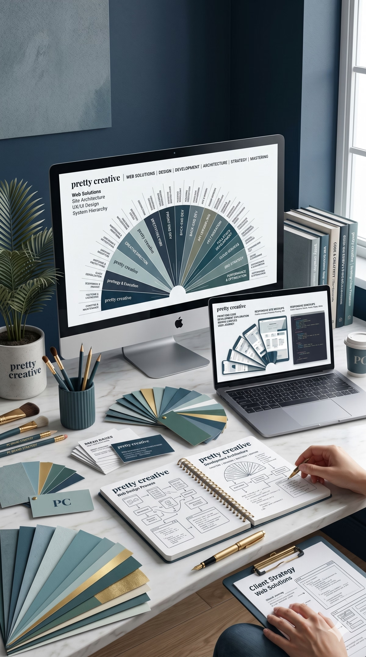
When you design your visual identity, you have to carefully consider your brand identity, target audience, color psychology, accessibility, versatility, and look for inspiration to create a unique and impactful brand color palette.
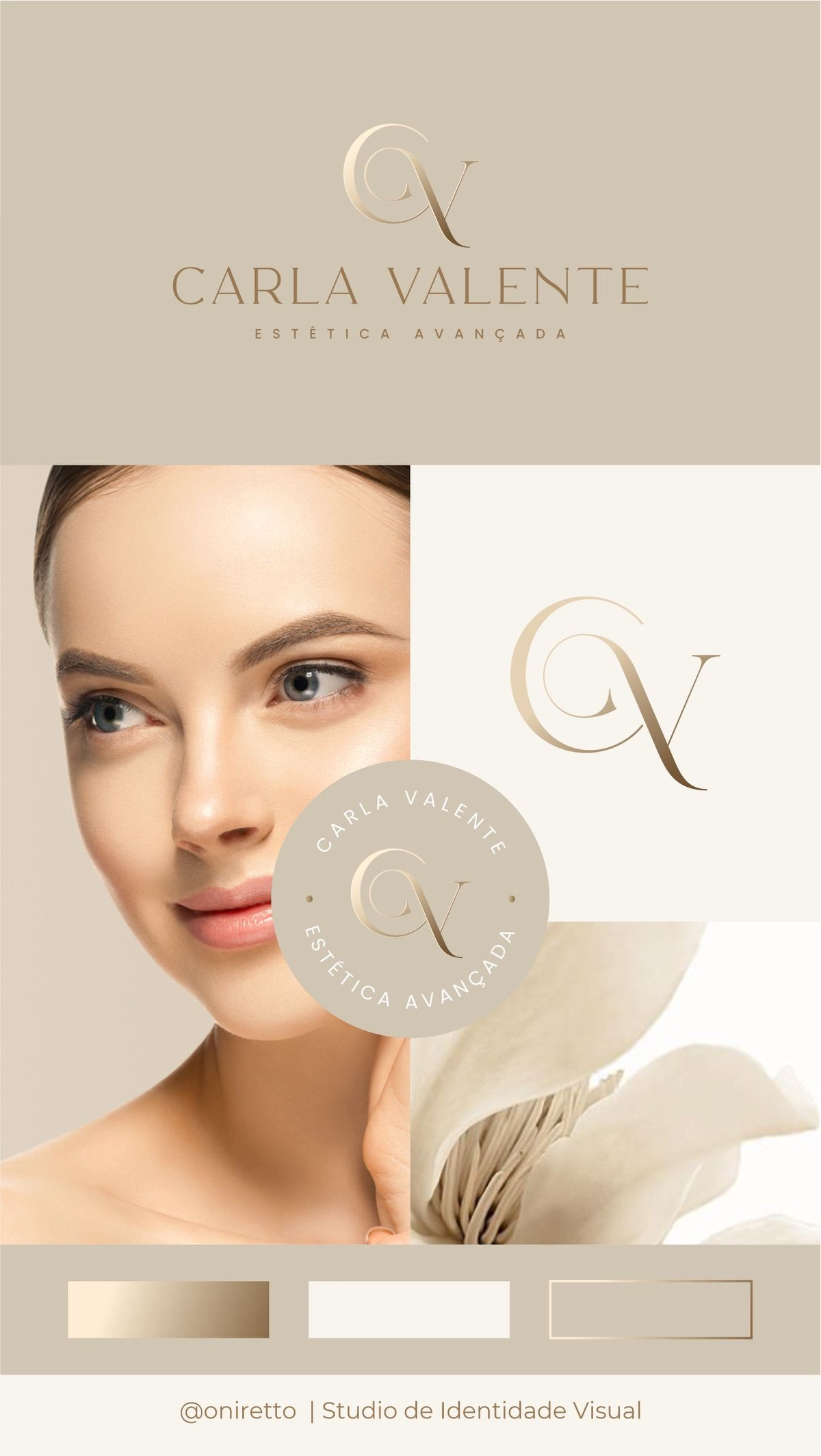
A professional, balanced colour palette typically consists of three elements:
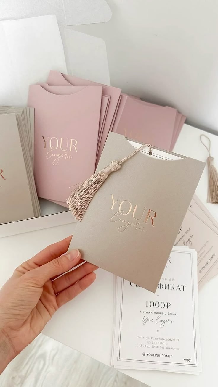
You also need to keep your target market in mind. You should consider your audience’s preferences and demographics when choosing your color palette. For example, for a predominantly male audience, opt for colors like blue, green, or black, whereas for a predominantly female audience, consider colors like pink, purple, or pastel tones.
Colour psychology also plays a massive role in how people interact with your website.
Colour psychology is the study of how colors can evoke different emotions and perceptions in people, and it can greatly impact how your brand is perceived.
Blue: Blue is often associated with calmness, trust, and stability.
Red: Red is often associated with strong emotions such as passion, excitement, and energy.
Yellow: Yellow is often associated with optimism, warmth, and happiness.
Green: Green is often associated with nature, growth, and freshness.
By understanding the psychology behind the palette, you can create a beautiful visual identity that subconsciously builds trust with your new customers from the moment they click on your site.